Monday 19 August 2013

Oak-ey Dokey

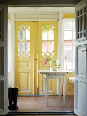
My sister in law Kriston and her family were here in Calgary a week ago and her and her husband Scott were throwing around the idea of possibly... maybe... let's think about it some more.... moving. With a recent teenager in the family and two more kids close behind things were starting to feel a little cramped at their place. This weekend (only 5 days after they left our place) she called to tell us they bought a house and are moving in next weekend!! The house is a beautiful 100 year old character home on a tree lined street backing onto a park. The house is full of rooms covered in wallpaper which for me makes it even more exciting. This place screams dramatic before and afters.


The previous owner was a carpenter and he put a lot of love into this home. The cabinets in the kitchen were built by him and Kris says they are in great shape. However they are oak, which definitely can look dated. There are tons of great tutorials in the blogger universe on painting cabinets but it's a huge job.  A lot of people buying older homes are left in the same boat- wondering how to make the oak work. I got excited about the idea of creating a mood board centered around oak cabinetry, which can hopefully serve as inspiration to other oak kitchen owners who are paint-over-wood adverse.
In Kris and Scott's new place the kitchen is large enough for a table but thanks to the attached dining room Kriston is opting for a big butcher block island instead. This family is not afraid of bold design choices so I think painting out the island in a fun color like this would look great.

 
via dustjacket attic

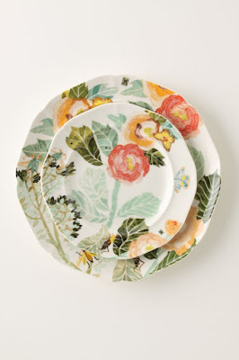
Scott's brother makes gorgeous pottery and they have a beautiful collection of his work including most of their kitchen dishes. Removing some of the upper cabinets is a great way to open up the kitchen, eliminate some of the oak and provide a functional area for displaying some of their dishware. Win, win, win. 

via Traditional Home

Adding in some woven roman blinds to the windows in a similar tone to the cabinets will keep the taller cabinetry from feeling unbalanced.

To make the kitchen light and bright I would paint the walls a soft grey with a slight blue undertone to prevent the cabinet's from casting an orangey tone on the walls.

Kris and Scott plan to replace the countertop with granite and with this color scheme I think something not too busy in grays and whites will look great, a few golden flecks will tie in the oak.

 
Bianco Romano Granite from MSI stone

Back splashes are a great place to add in some personality and with this you could go in a million directions. I personally am loving this hex tile...

via amazon.com

A classic white subway tile or penny rounds would look great too.

And here are all these ideas mashed onto one mood board...


Kris and Scott both love interior design and whatever they decide to do is sure to look great.  I was constantly inspired by their first home which was very modern- it looked like it could have rolled off the pages of Dwell magazine. I can not wait to see how they tackle this more traditional home and bring it into this century!

Congratulations Kris and Scott! You've had me dreaming of moving to Moose Jaw all week. Can't wait to come and visit and take down some wallpaper. We'll bring the Dr. Pepper and skittles:)

Saturday 27 July 2013

Winner of the {Orange Trunk} Giveaway!

I am excited to announce Jennifer Jackson as the winner of the $75.00 gift certificate for {Orange Trunk} Vintage Rentals. Congratulations Jennifer!
 
...And as if the gorgeous vintage furniture and accessories weren't cool enough, check out the vintage BMW {Orange Trunk} added to their collection this week!

Saturday 20 July 2013

{Orange Trunk} Vintage Rentals and Reader Giveaway

I am so excited to be featuring the talent behind {Orange Trunk} Vintage Rentals, here on the blog today! Karen is a friend who's creativity and no details spared party planning skills have always inspired me- so when I heard she and business partner Heather were making their mark on the Calgary event styling scene, I wasn't surprised! I'll pass it over to Karen to fill you in on what this talented duo have to offer and how their shared passion of vintage everything sparked {OrangeTrunk}...

An addiction, a craving, an obsession, a serious jonesing... Whatever you want to call it, we are totally in love with anything vintage. {Orange Trunk} Vintage Rentals and Styling has grown out of this love of vintage finds. My partner Heather and I have curated a collection of special pieces, from the ahh worthy Underwood typewriters to the fun chalkboard chippy doors available for rent in Calgary and surrounding areas.


Vintage is in our DNA and mixing it with styling events such as weddings, photo shoots, showers, and window displays to name just a few, seemed like a perfect match. 
 
There is a certain rush we get meeting with new clients trying to match up what is in our collection to their specific needs. Whether its the addition of a bundle of vintage books tied just right with twine, or of words spelled out in Scrabble tiles adding that extra detail, or a special message written on one of our chalkboards...


our mission is to make our clients' events unique and gorgeous. We are constantly on the hunt for new additions to our collection with new finds on the hunt for new additions to our collection with new finds almost daily and are happy (almost giddy with the challenge even!) to seek out specific requests from clients. 
 

We have tried to set ourselves apart from others in the industry by offering reasonable pricing, promotional free delivery, and no minimum order. We really just have a passion for making things pretty and fun with vintage. Check out our growing collection on Facebook, Twitter, and Instagram or book an appointment for a viewing with us at orangetrunk@hotmail.com!

Seriously- what Super Hero party is complete without vintage phone booth to transform in? Not only are these ladies talented they are also generous! They are offering a $75.00 gift certificate to one lucky reader. If you have a photo shoot or event coming up you don't want to miss out on this (don't forget to let your friends know!).
 
 
You have 3 chances to enter by:
 
1) liking {Orange Trunk} on facebook (leave a comment on there page to let us know)
2) tweet about @orange_trunk 
3) reposting a link to this blog post on your facebook (leave a comment on the blog to let me know). 
 
There will be a random draw to determine the winner later this week. Check back on Friday to see if you've won!


Sunday 16 June 2013

The Door Diarys- Part 1

Doors- I love them! I spend a lot of time looking at pictures of doors. This one won my heart a few years ago...


...and inspired the soft yellow doors that have been cheering up my home for the last three years. Lately though I have been craving a change. These are some of the doors that have been making my heart flutter recently...


All above images via pinterest.com

It seems like everyone is all for painting the exterior of their doors, but why not inside? Painting the doors in your home, if you have fairly neutral walls, is a great way to add a bold dose of color without painting your whole home. Another huge plus is that it's cheap and fast. You'll need less than a quart of paint to do your front and back door and about an hour of time. My doors will a get a summer makeover early this week and I'm excited to share the results!

What's your vote? 


Monday 27 May 2013

Closet Decorator: Mint and Floral Breakfast Nook

Eating areas are highly neglected in the decor department. Plunk down a table and chairs and call it a day.  Such a lost opportunity. I don't know about you but I spend a lot of time around our table; eating (I know-strange, right?), crafting, game playing, visiting, blogging. It may as well be a nice place to spend time.

This is the outfit I chose for some inspiration today...


A girl wearing this outfit obviously has no problem with trends- she's rocking a bold sheer floral top with hits of mint and gold. This is a casual outfit- jeans and flip flops- and anyone rocking a bold print on a casual day is confident in there fashion choices. With that in mind I decided to put together a space that features a few fun decor trends- curtains with ball fringe a chalkboard wall and bold florals.

Dining table- Layla Grace, Rug-Anthropologie, Dining Chairs- unknown, Curtains- DIY


Here's a pic of that gorgeous Anthropologie rug, not cropped up...
Gloria's Garden Rug- Anthropologie.com


With chalkboard walls don't be afraid to hang art/photographs on them...


If a rug is too impractical for your eating area you could bring in a bold floral  through your dishes...


Watercolor Petals Dinner Plate- Anthropologie.com 

Or if you have a banquette a couple of these pillows from Indigo would be an easy way to incorporate this trend...

Bluebellgray Anemone Pillow
These pillows are gorgeous and the colors are super saturated in person. Once they go on 50% off I may have to make them mine- when Trent's not looking of course (for some reason florals aren't his thing).

Whatever you decide- your dining area should be a space you love to hang out in and don't be afraid to express your personality!

Tuesday 19 March 2013

Day Dreaming About Bedtime

The only thing I knew I for sure wanted for the direction of our bedroom was that it had to be visually uncluttered. With the busyness of life and all the toys and random stuff that comes with kids, I want a place of visual calm to go to at the end of the day.

After pouring over pinned images of bedrooms that I love I narrowed it down to my two favorites (neither of which are as visually calming as I had in mind for our room)...

Guest Bedroom by Emily Henderson


Master Bedroom by Emma Reddington
 They both have quite different vibes. The guest room designed by Emily Henderson is preppier, more tailored, and to me has a younger feel. Emma Reddington's master bedroom (the designer behind The Marion House Book) is more casual and rustic and travelled. I love both a million times over but how, with such completely different feels-and neither of the them being the more minimal look I'm after- does that help me figure out the direction I want to go in my room? Well,  for all their differences they do have a number of shared qualities. Neither space is matchy matchy, they both mix many different textiles, colors and patterns. Both have a heavy dose of inky blues and both rooms are light and airy with the exception of the bedding. This last point was probably the most important for me to realize because I have always LOVED white bedding. I have had white bedding for at least the last 15 years. Nothing feels as clean and fresh, and just makes me want to fall into it, than a bed with fluffy clean white bedding bathed in sunlight. However now with three kids I spend very little daylight hours in my room. A cozy bed layered with moodier colors in a mixture of textures and pattern now makes so much sense to me.  Against a white/cream/light grey backdrop I think the room will still have the calming quality I'm after while the bed will be a cozy corner to crawl into at the end of the day.
This is what's on my radar right now.
1. Ikea BJORNLOKA LINJE Curtains- 2. West Elm Linen Cotton Duvet Cover- 3. Dell Shop Etsy vintage textile-
4. West Elm Organic Lattice Sheet Set- 5. Pottery Barn Valencia Tall Dresser- 6. Jessica Rae Sommer Portrait-
7. CB2 Satellite Pendant Lamp

1. The curtains are a sure thing. I bought them on an Ikea run this weekend. It's hard to tell from this picture but they have thin black stitched stripes running vertically down the otherwise white cotton panel. They are light and airy and won't compete with the dark bedding but because of the black stitching will still tie in.

2. The grey west elm duvet cover will be on my bed hopefully by the end of next month. It's back ordered right now but I ordered it this weekend while they were having a 30% off sale. It's a linen cotton blend so it will be soft and slubby and hopefully give my bed the causal laid back vibe I'm after. Everything else is still up in the air.

3. The blue vintage textile is an Etsy find that I think would make some great accent pillows. There are so many gorgeous vintage pieces on etsy. I also really love the colors in this one...

The Little Grass Hut Etsy shop
...but it looks like it has dead fish on it and dead fish on my bed somehow doesn't scream "come cuddle" - but maybe that's just  me?

4. These sheets are still a maybe. I love the way the golden yellow will look with the charcoal grey duvet and inky blue pillows and I like the subtle pattern. I've spent enough money on this room for this month though so we'll see if I still want them after my bank account has had some time to breathe.

5. The dresser in the picture is purely for inspiration. Trent and I are keeping our eyes out on Kijiji for a tall wood dresser that is either already a nice warm wood tone- to complement the leather bench- or can be refinished in one. We want something tall to help replace some of the drawers lost after switching from two dressers to one.
6. The portrait is by super talented artist Jessica Rae Sommer, and I love her work! This piece is a favorite. I think it would fit in nicely with a couple other black and white photos and maybe a more masculine art piece for Trent, over the dresser. Trent thinks a picture of a stranger drinking wine in our bedroom is weird. I'm pretending she's drinking coke because that's my favorite after a long day (yup, I'm super classy/healthy like that). As for the stranger danger thing I think he just needs to get over it. Besides, she's looking down so it's not like we'll see her staring at us while we're changing or during other private moments.

7. I'm also hoping to DIY something similar to the CB2 light fixture. I Think it will be a great sculptural piece to balance all the layers of fabric in the room.

As for a headboard I want something comfortable to lean against so something upholstered will happen somewhere down the line. Both Trent and I love this one...


simplyseductive.blogspot.ca 

We're thinking we will try to DIY a simpler version of this, not as tall and less tufting with no wrap around but something similar to this color. Our room still has a long way to go and will evolve over the course of the next few months but I'll keep you posted as things happen along the way.


P.S. I always love to hear from you! What's your opinion on "strangers" in the bedroom? If you could add/replace one thing in your room what would it be?

Friday 15 March 2013

The Little Bench That Could

Posting these next few photos is not the easiest thing to do. Kinda embarrassing. My master bedroom is the most neglected area in our home. Our door is always firmly closed when people come to visit and I go in there only to sleep. It hasn't really changed at all since the day Trent and I moved in three years ago...


We plunked down our king sized bed centered on the biggest wall in the room. We placed a couple of cheapy Ikea MALM dressers along the one side and Trent cut a piece of white laminate to go across the top so the dressers could act as a vanity. Not a lot of thought went into it but we just needed to get it up and functional. Over the course of the last few years I would lay in bed at night staring at the closet and bathroom door, on the opposite side of the room, and try to think of what I wanted to see happen in this space. Let me tell you, bathroom doors and closets are not a very inspiring view. A complete decorating block.


Enter the little bench that could. My mom found this great vintage leather bench at an auction and walked away with it for $5.00. It has a small split in the stitching but other than that it's in great shape. She was hoping she could flip it online. When I saw it in her living room last weekend I knew Trent would love it and thought maybe it could work at the end of our bed. After some tough negotiating my mom said I could have it for $10.00. Win win- I still got a great deal and my mom made %100 on her investment. As expected Trent was pretty excited when I lugged it into the house at 11:00 at night. 


However it didn't work with the height of our bed and even if we lowered the bed there wasn't much room left between the bench and the closet doors. 


There really was nowhere else in the house it could go  other than our bedroom (with only 1100 square feet and 3 kids space fills up fast) and I wasn't ready to give it up just yet.

This little bench has completely unblocked me. My dreaming went a little like this- wouldn't the bench look great under the windows... if only the bed wasn't in the way... where else could the bed possibly go?... It would fit along the walls where the dressers are, but then there is no where for both dressers... wait a minute? Haven't the dressers only really served as a place for piles of junk that need to be sorted and it's always so covered in crap that you can't do your makeup there anyway? (did I mention a whole lot of stuff got shovelled into the closet before we snapped these pics)... Why yes that is very true Cory... light bulb moment. So the dressers have been separated and one moved out, the bed now faces the windows and the bench is in it's rightful place under them. I can't get enough of the new layout, the room feels so much bigger, and the new view out the south facing windows is much more inspiring. Now my brain is going crazy with decorating ideas and I'll give you a rundown on a few of them next week, once I've had time to organize my thoughts. I think it's safe to say that this room can only get better.


It's amazing how one little item and some furniture shifting can really inspire you. So if you're stuck in a similar place feeling like nothing is really working then try moveing some pieces around and reevaluate what really needs to stay, and see if that gets things going.  

Wednesday 13 March 2013

Picture Frame Headboard Reveal

Better late than never? Sorry for the delay friends.

As everyone knows, all great makeover posts start with a super pretty before photo. Check it out...


When my sister (Erin) and her fiance (Alex) moved into their home just over two years ago they painted the whole house grey and wanted a punch of color in the bedroom to go with their all white bedding. They chose this pretty blue- young and fun. After hearing there bedroom was painted blue Alex's Grandma made them this beautiful quilt in shades of blue. Unfortunately the wall color and the quilt were just not getting a long. Once Erin and I had decided a headboard makeover was in the works for the Winter Pinterest Challenge it just seemed like the perfect time to repaint. We knew we needed something that wouldn't compete with the quilt and Erin wanted something light and airy so we chose Benjamin Moore Dune White. It's a creamy white with a slightly greyish undertone.

We bought Benjamin Moore's Aura paint because I have never ever needed more than two coats to cover even the darkest color and we knew we wouldn't have time to get up more than two for what was supposed to be our one day project. Of course things can't ever go completely to plan- That lovely blue ended up needing FOUR coats to cover! Even with that curve ball, the one hour drying time between coats and my awesome husband jumping into help paint made it possible to finish in one (slightly later than expected) evening. If you haven't used the Aura paint I would highly recommend it. It is pricey but it goes a long way. Four coats (and seriously that is so rare) only took one gallon of paint to paint a master bedroom.


This is how things are looking today with the black and white photo's Alex took of his and Erin's trip to Europe. The room feels really calming and more grown up now. The color is beautiful. I love it so much I'm thinking of using it in my master. It's nice and warm and yet still fresh and clean.


To create the headboard we used the RIBBA frames from Ikea in the dark glossy gray finish. We chose a dark frame for the pictures to help balance the visual weight of the quilt. Something heavy/dark on the bottom needs something heavy/dark up top to balance it. It's kinda like Kim Kardashian. She has a beautiful body and she can pull off that curvy butt because she's also blessed up top. Without that balance I'm going to guess there would be no Kardashian empire.


While we were at Ikea we also picked up (honestly, is it possible to go there and only come out with the one thing you went in for?)  three large throw pillows with the AKERKULLA pillow covers to act as a buffer between the frames and the back of Erin and Alex's head when they are sitting up in bed. 


The reason we didn't hang the frames high enough to clear their heads is because it would have looked way to tall and the dead space between the bed and the photos would have been awkward and we would have lost the headboard effect.


I really love the way it turned out, the frames have such an big impact. I also love that they're so versatile. If Erin and Alex end up getting a real headboard or moving someday then the frames can be split up or rehung above the guest bed.


And for once all the photos in this post are my own. Moving up in the world. Still a lot to learn but making progress. Check back tomorrow to see what's inspiring me to finally tackle my master bedroom.

Wednesday 27 February 2013

Pinterest Challenge: Picture Frame Headboard


When Sherry (Young House Love) and Katie (Bower Power Blog) announced their seasonal (completely unofficial) pinterest challenge, I did a little happy dance in my seat. As a new blogger I am excited to have an opportunity to get my little blog out there.

My sister has been wanting to give her room a makeover for a while now and we had been searching for some DIY headboard inspiration so I called her up to see if she wanted to take part- she was all in. She wanted something simple with big impact and that could easily be reused in another room if her and her fiance ever upgraded. We thought about trying our hand with an upholstered headboard but their bed is the only king sized bed in their home, so reusing it for a different bed wouldn't be ideal. We finally decided on this pic for our pinspiration...

image via bhg.com
And it was almost a success- keyword being almost.

Saturday was a marathon of running around gathering stuff for the room, which somehow expanded to us repainting the entire thing (FOUR coats of paint!) at 8:00 in the evening. After all that we ran into a little hiccup printing some black and white photos of my sister and her fiance's recent trip to Europe. So sadly this is all you get for now.


I promise to have full before and afters up early next week! In the mean time check out the projects Sherry, Katie, and their co-hosts Megan and Michelle turned out for the challenge.

In other news I got to spend today celebrating this amazing man's birthday!


Trent is my absolute favorite person in the world: the best dad I could ever wish my kids to have, a great partner in all things life, his creativity and compassion for others inspires me every day. He's always looking for ways to better himself as a husband and father and friend and I am so very grateful to have him in my life.

Tuesday 26 February 2013

Closet Decorator: Coral & Navy

This post was inspired by my younger sister, Erin.  Since the day Erin was born she has  loved fashion.  She would ask for shoes and clothes for Christmas instead of toys, much like my oldest daughter Tayah. She always looks fantastic and has no problem pulling an outfit together. She isn't afraid to take risks but when it comes to her house she's stumped. She knows what she likes but she's never quite sure whether or not something is really "her". 

We've been getting dressed and making choices about what we wear almost everyday of our lives and decorating a home for only a small fraction of that, so it makes sense that most of us would feel more confident in our clothing choices. If you are one of these people this post is for you. I'm going to show you how to turn your favorite outfit into a space that can't help but reflect your taste.

First choose your favorite outfit. It doesn't have to be one you own, just something that you know is you 100%. After a little pinterest browsing I came across this prettyiness...


Next you'll want to identify what exactly it is you like about your outfit. In this case, I love the updated 50's vibe and the colors. It's has a structured look to it and classic porportions but the fabrics aren't fussy and theres a casualness to it. If done properly I should be able to say all the same things about my finished room.

Now let's get down to decorating. It's bussiness time (side bar: if you haven't seen it, check out this Flight of the Choncords video, I think it's funny, you might too). Start with the color foundation. The three main colors in this room are going to be white, charcoal, and coral. These colors will be the colors of the major pieces in the room.

I chose white walls, because I love white walls. This skirt was dying to be reinvented as romantic draperey so coral curtains it is. Charcoal for the sofa, because as much as I love a dramtic colored sofa or even a bold patterened one, the wiser long term choice is to use something more neautral for the most expensive items in the room.

The style of the pieces you choose is also important. I chose a sofa that reminded me of the retro vibe I liked about the outfit and the buttons on the couch were inspired by the buttons on the skirt. Along those same lines the woven rug reminded me of the strap of the purse. A good start but boring, unfortunately this is where a lot of people quit and are left frustrated wondering why there space still doesn't quite feel right.

Time for some secondary furniture pieces. We could use some more pieces in white, coral, or gray but I wanted to make things a little more interesting. Since there are no visible shoes in the picture I decided that if I was wearing this outfit I would want to where some cute navy flats with it. With that in mind this is where I ended up in phase 2...


Don't navy and coral look great together? Yum. I chose the leather safari chair because it's classic and casual and the leather ties in with the belt in the outfit. The amazing chandelier is gold like the earrings. I think a room could be empty with only that Jonathan Adler chandelier and still look gorgeous. It's been a long time favorite of mine and in my dreams it hangs happily in my home. 

The room is starting to take shape but still a little lifeless, let's take it one step farther and add in some accessories...

(sofa, ottomans, chair, chandelier, rug,  picture frames, pillows)
Personal photos in black and white (shirt and cardigan), white and coral cushions and another hit of gold. 


I think this girl could happily live here...


 What do you think? Are there other Flight of the Conchord fans out there?

I had so much fun putting this post together I'm thinking of making Closet Decorator a regular feature. If you have an outfit you'd like to see turned into a room send me a link.